Ranking All the Current White Sox Uniforms From Worst to Best
From the simple throwbacks to the top-tier City Connects, Just Baseball presents our Chicago White Sox uniform rankings.
The Just Baseball Uniform Rankings are off and running, as our staff ranks the current sets from each of the thirty teams in the league.
Fittingly, I decided to tackle the White Sox rankings. The team might be failing to produce on the field, but their uniforms are great in my view.
The White Sox have changed their style numerous times over the years, but they’ve settled in in recent history with a new special set that has become a fan favorite and a throwback that has taken over Sunday games in Chicago.
Let’s get into the rankings for my hometown team.
5. Alternate Black
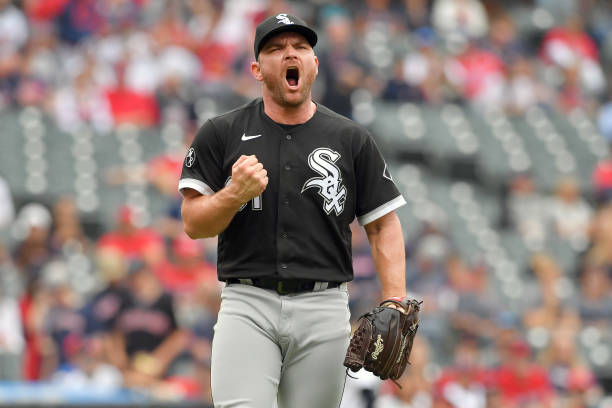
This uniform is just sort of boring. I don’t mind it, and it fits the White Sox modern style with the grey pants, but it doesn’t offer much. The black jersey with the grey pants works well but offers nothing unique. It’s a clean concept that works and is different enough from the two main uniforms to be interesting.
The logo and number on the front are standard, but the sleeves’ patches make the jersey stand out a bit more for sure. These uniforms work, but they represent more of the mediocre present White Sox than the historic elements brought out by the other regularly worn sets. This alternate is far from a bad uniform, but it isn’t at the level of some of these next ones in my opinion.
4. Road Grey
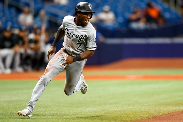
It hurt me to rank this set fourth on this list because the cursive “Chicago” is one of the best fonts on any jersey in baseball. This road uniform is a classic that the team has been wearing for upwards of thirty years and for a good reason. They fit the team well, and the all-grey look is something that doesn’t always work, but it does here.
The understated stripes of black and white on the sleeves add another dimension to the look that elevates it without taking the focus away from the cursive letters. These are simple and classic, but they’re still an excellent option and one of the best grey uniforms in the league.
T-2. Throwbacks
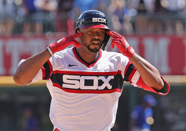
Some White Sox fans are not going to like this ranking at all. I honestly believe that the top three on this list are interchangeable and really just represent different eras of baseball and White Sox history. They’re all different but amazing in their own ways.
This jersey is totally different in color and style from the modern White Sox look, but it perfectly represents the era of baseball before black, white, and grey became the colors of the team. The “SOX across the chest is great, and the blue and red are bold enough to make the letters pop even more without doing too much. This look is simple, but it shows what that era of baseball was all about and should continue to be the Sunday uniform in Chicago for a long time.
T-2. Home White
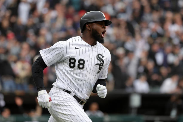
I truly could not decide between the current look that represents the team and the old look that represents the White Sox of the 1980s. This is the current home set that has been worn by the team since 1991 and set the groundwork for the entire modern marketing of the franchise.
The pinstripes are classic, and the creative “Sox” logo is one of the coolest in baseball. When people discover that the logo spells “Sox” it often blows their mind and for good reason. The uniform is simple and elegant, and you don’t need much more when you’ve got pinstripes and a sick logo. The silver outlining makes the black font pop even more on an already good look. I see no reason for this not to remain the home jersey for many years to come.
1. City Connect
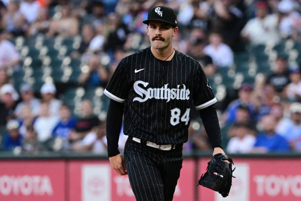
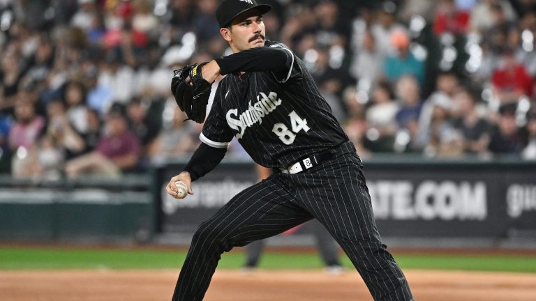
Yes, I did rank a City Connect uniform as the best. And that’s because this is the best City Connect in the league (Sorry Marlins fans, you’re a close second). This is everything that a modern-day uniform should be, and it represents the type of baseball team that I want the White Sox to be.
The pinstripes tie together the historical roots of the team and the current home uniform, while the font adds a bold and exciting element. Using “Southside” brings in the city and the culture of Chicago as well. The most underrated part of the set is the “Chi” hat that I now see people wearing all over Chicago. It’s hard to beat the classic White Sox hat, but this one is doing its best. The all-black look can be tough to pull off, but this set does it perfectly and is one of the best in all of baseball.
